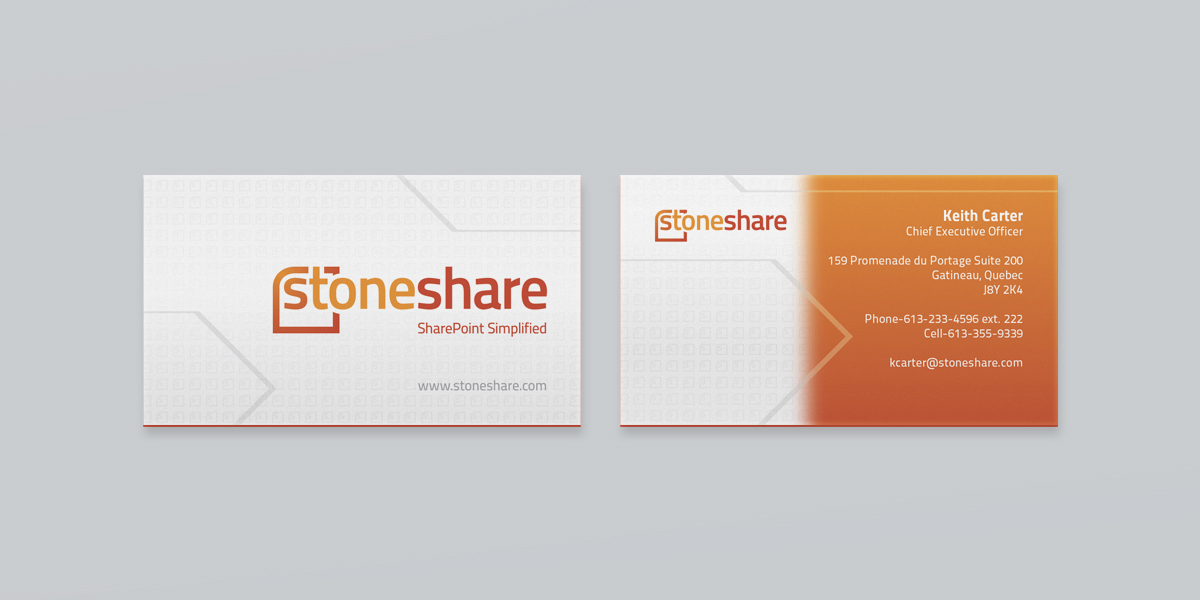
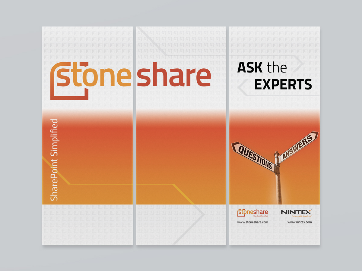
StoneShare, a small Microsoft SharePoint services company based out of Hull-Gatineau, ON, was in need of a rebrand which encompassed an updated logo accompanied by various applications, such as business cards and roll-up ads.
The main design objective was to revamp their old black and red wordmark logo to a symbol + wordmark with a new colour palette. A modern typeface, Titillium, was used to make StoneShare current. The new ’S’ symbol was something that was analyzed in great detail. Through many concepts and revisions, StoneShare chose an abstract version of the SharePoint software icon. The symbol also interacts with the typography, adding depth to the mark.
Colour selection was very important, as numerous concepts were considered to get the desired result. The final colours are an off-red and burnt orange, similar to the SharePoint software icon.
The result is an identity and brand look that balances form and function.

 /
/